
Apple: Minimalist Ad Copy Secrets
Apple isn’t just a tech company—it’s a global symbol of design, innovation, and brand power. With every product launch, billboard, or digital banner, Apple doesn’t just market features—it sells a lifestyle, an emotion, a vision of the future.
One of the brand’s most distinct and influential traits? Minimalist ad copy.
Where competitors may drown consumers in specs and jargon, Apple whispers. With just a few words, it sparks curiosity, builds desire, and communicates unmistakable value. In a noisy world of cluttered marketing, Apple’s silence is thunderous.
In this article, we’ll dive into the psychology and structure of Apple minimalist ad copy style. You’ll learn how “less is more” fuels emotional connections, clarity, and consistency—and how to apply these principles in your own brand messaging.
What is Minimalist Copy?
Minimalist copywriting is a stripped-down approach that emphasizes clarity, brevity, and resonance. It removes the fluff, gets to the point, and evokes a reaction—without overexplaining or overselling.
Key principles of minimalist copy:
- Brevity: Say more with fewer words.
- Clarity: Remove ambiguity; deliver direct messaging.
- Purposeful silence: What you don’t say matters.
- Emotional impact: Every word must pull emotional weight.
- Visual harmony: Works seamlessly with design, not against it.
Apple’s minimalism isn’t a mere aesthetic. It’s rooted in its brand philosophy: simple is powerful. From its product design to store layouts, simplicity is Apple’s language. That language flows into its copy.
Where most brands try to explain themselves, Apple makes you feel something instantly.
The Apple Approach: Key Elements of Minimalist Copy
Apple’s copywriting isn’t just minimal—it’s strategically minimal. Let’s break down the pillars of this approach.
a. Simplicity and Precision
Apple headlines are often just one line—sometimes one word. But each is meticulously crafted for punch.
Examples:
- “Light. Years ahead.” (MacBook)
- “Say hello to the future.” (iPhone X)
- “Think different.” (Brand campaign)
- “Don’t blink.” (Apple Vision Pro)
These headlines:
- Spark curiosity
- Deliver value immediately
- Use poetic rhythm or contrast
💡 Visual Suggestion: Mockup side-by-side of Apple’s “Light. Years ahead.” ad vs. a tech competitor with detailed specs.
b. Focus on Benefits, Not Features
Instead of highlighting processor speed or RAM, Apple paints the experience.
Compare these two statements:
- Typical tech copy: “6-core processor with 4.2 GHz turbo boost.”
- Apple-style copy: “Power to create. Anywhere.”
Apple rarely sells the technicality—it sells the result. This invites users to imagine themselves living with the product.
Examples:
- “Snap. Edit. Send. Smile.” (iPhone camera features)
- “All in a day’s charge.” (Battery life benefits)
c. Visual Pairing: Copy and Design in Harmony
Minimalist copy is only half the equation. Apple’s use of clean, whitespace-rich design elevates every word.
- Copy is surrounded by space, demanding attention.
- High-res visuals show what the copy hints at.
- Layouts guide the eye from headline → image → CTA effortlessly.
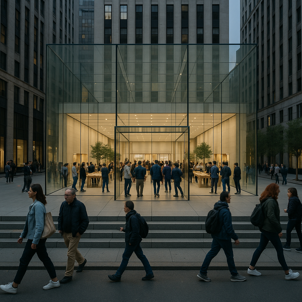
💡 Visual Suggestion: Screenshot of Apple’s homepage (with minimal text + hero product image).
d. Emotive Language
Apple often uses emotionally loaded words: love, magic, freedom, life, wow. This isn’t an accident—it’s emotional branding.
Examples:
- “Lose yourself in 100 million songs.” (Apple Music)
- “A magical new way to interact.” (Vision Pro)
- “Love the power. Love the price.” (iPhone SE)
The emotional resonance turns gadgets into companions, features into feelings.
The Psychology Behind Apple’s Copy
Apple’s copywriting taps into powerful psychological principles:
1. Cognitive Ease
Minimalist copy reduces decision fatigue. With fewer words and clear visuals, the brain processes information faster—making the message more memorable and persuasive.
2. Whitespace = Breathing Room
Whitespace is not just aesthetic—it’s psychological space. It:
- Draws attention to the message
- Implies elegance and sophistication
- Improves comprehension
3. Emotional Priming
Apple primes emotions with its copy before logic kicks in. Words like “magic” or “freedom” activate subconscious desires, tapping into the aspirational self.
4. Implied Authority
By not over-explaining, Apple appears more confident. Silence communicates power. You believe it’s premium because they don’t need to convince you.
Case Study Breakdown: Apple Vision Pro
Let’s dissect the copy used for the Apple Vision Pro launch.
Headline:
“Welcome to the era of spatial computing.”
Subtext:
“Apple Vision Pro seamlessly blends digital content with your physical space.”
Supporting Copy (on product page):
- “You’ve never seen anything like this before.”
- “A revolutionary new input system.”
- “More pixels than a 4K TV for each eye.”
Structure Breakdown:
- Hook (headline): Short, ambitious, futuristic.
- Intro (subtext): Communicates the core value in one sentence.
- Detail (supporting lines): High-impact phrases focusing on experience.
Tone: Confident, visionary, clear.
💡 Visual Suggestion: Screenshot of Vision Pro product page with callouts on copy blocks.
Lessons for Marketers & Copywriters
Ready to bring Apple’s copy strategy into your work? Here are 6 actionable takeaways:
1. Write with Purpose
Before writing, ask: What emotion or idea do I want to leave the reader with? Then eliminate anything that doesn’t serve that purpose.
2. Trim the Excess
Use the one-sentence challenge: Can you summarize your product’s core benefit in one sentence or less? If not, simplify further.
3. Focus on Feelings
Instead of “X GB of storage,” try “Room for everything you love.” Connect with user desires, not just functionality.
4. Pair with Clean Visuals
Your copy should match your design. Avoid clutter. Use hierarchy (bold headlines, smaller subtext) to guide reading.
5. Use Short, Punchy Headlines
Apple’s headlines rarely exceed 4–6 words. Use rhythm, contrast, or surprise to make short phrases impactful.
6. Let the Product Speak
If your product looks great, show it. Let your visuals do the heavy lifting, and use copy to spark curiosity or emotion.
Apple’s minimalist ad copy is proof that doing more with less can drive massive impact. It’s not about laziness—it’s about precision. About knowing what matters most to your audience, and delivering it in a way that feels effortless.
If you’re a marketer, copywriter, or brand strategist, Apple’s style challenges you to go deeper by saying less. Simplicity takes discipline—but the rewards are clarity, emotion, and timeless brand appeal.
✨ Try this today: Revisit one of your existing headlines. Ask yourself—can you make it shorter? Stronger? More emotional? Apple-style?
